Friday, 23 February 2018

Digipak Inspiration


Moodboard:

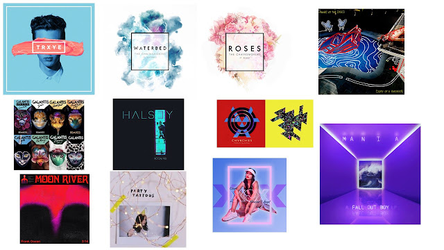
In order to find inspiration and ideas for my digipak, Erika and I went through a handful of artists and google searches and decided that the ones we liked we would put together on a moodboard. This is so that when the time comes to designing my own digipak I can refer to this for ideas which I can manipulate in my own way for my own product.


This photo above was the first set of albums that we managed to find with the general search of "digipaks". What I like in particular is the shapes these artists use, and how there is a picture in the shape, for example with Michael Jackson's "This Is It". For Rihanna I liked the rose imagery and how the disc is a rose, which is also a huge part of Outlex's brand image, my artist.


This photo was when we were thinking of artists in particular that we like and have interesting album covers. I like the Chainsmokers' covers for singles such as "Roses" as I think the box with the painted background is something I would like to try and could suit my artist's image. For "Mania" by Fall Out Boy I like the bright colour and lighting, as neon colours and lights is part of the conceptual imagery in my music video and I might want to incorporate that into my digipak. Overall on this photo I love the bright colours and shapes, they stand out compared to other albums we might see.


This final photo is similar to the last in which we looked up various artists and also went through our own music library to see if there are any covers that stood out to us. Here I like the bright colours in the albums and I really like the fonts, e.g. Bastille and Daft Punk. With Daft Punk I thought about How I could do that text with a roses background, or even with a photo and not text.

Looking up all of these albums helped me to gain more of an idea on what I want to be included in me digipak in terms of colour, text and the props in the photo. I have noticed that the artists aren't on many of these album covers, but instead images associated with them and their album, which is the approach I could use for my digipak.

Fall Out Boy- Website Research

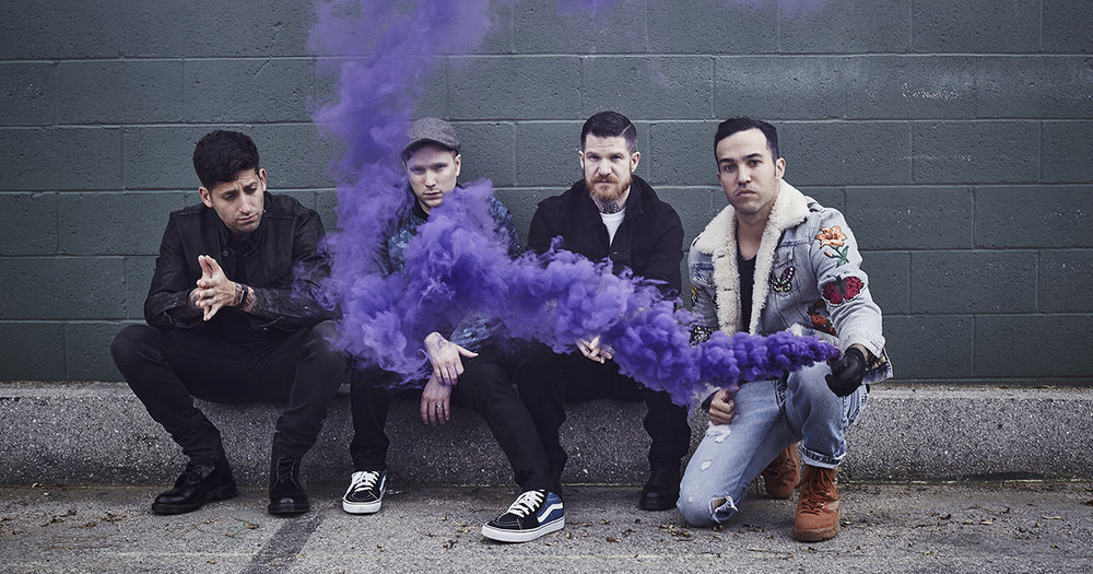
Image result for fall out boyFall Out Boy are a band that have been producing music since 2001, and have been signed onto multiple record labels such as Uprising and Fueled by Ramen, Island, and DCD2.
Although previously considered to produce music from the genre of rock, Fall Out Boy have gradually altered their music with each album, resulting in their most recent one released January 2018, Mania, being highly electronic as well as having the elements of rock from the older music, so it can be said that their new style of music is electronic rock. This is definitely reflected in their website and music videos, with neon purple being an important colour for them and their new brand image.

The first thing we see on the website is the cover for their new album Mania, with a link to purchase or stream the album, and a button to see upcoming tour dates that were released alongside the album. This front page we can see its all purple, a colour associated with the electropop genre, and the edges of this cube that seems to be in the future are also very brightly lit up, contributing to this neon theme. The photo in the middle is of the ocean but has been colour graded to be purple, so everything in the photo has this purple tint that stands out a lot due to its brightness and sharpness of colour.
This is the home page and we have the banner in the corner leading to other parts of the website, but we can also scroll down on this page where there are other promotions for videos and individual songs.

Below is a video of the website when being scrolled through, and how each photo fills up the whole screen, promoting different aspects associated with the band. I put this in a video to show the scrolling motion and how each photo is revealed and how it looks as though they overlap each other. The sections promote the tour and individual songs that have music videos, so as we can see there are links to watch the video and to go onto another platform to download or stream the song. I think that this is a really creative way to scroll through the website and showcase different features associated with the band.

At the bottom of this page we see a section where fans of the band can show off any merchandise that they have bought from the band using a hashtag on the social media platform Instagram. Underneath there are a few example photos that an individual can scroll through to see other fans showing their merch, and it encourages others to do the same so that they could be featured on the official website.

The next section includes all of the social media links as buttons against a purple background, fitting with the new theme of the band. The social media links include Twitter, Facebook, and even Tumblr; and there are also links to platforms in which their music can be listened to, such as Spotify and Youtube. Finally we have links to amazon, apple store and other platforms where music can also be purchased.
As usual we have logos/links for the record label that the band is signed onto, as well as their official logo at the bottom which can be recognised easily by fans. The record label link directs us to the official website of the label, so this website also promotes other artists if clicked on, as we can see other artists signed onto the same label. There are 3 listed below: Island, Crush Music and DCD2 Records.

If we go back to the top of the home page we see a banner with links to other pages, such as "News" and "Videos". The first link is News, and this page consists of a picture of the band at the top, and then we can scroll down to see updates from the band. The updates are about tour, such as performing in China and Reading Festival, as well as on shows such as "Good Morning America". These updates of course promote the band but can promote the festival and TV show that they will be featuring on. This page is good for fans wanting to receive these updates, especially if they want to see the band on tour, and they can also read general news such as announcing that the band's new album reached Number 1 on the Billboard 200.

The next link in the banner is "Tour", in which the layout is very similar to the news page, as we have a title at the top with a picture of the band as a background for the top banner. This page is like any other tour page, with a list of the dates and venues, then a link to buy tickets from Bands in Town, or instead the button can say "sold out" instead and not have a link to another page once the tickers from a particular show have all been sold. This is a world tour called Mania Tour, so there a lot of dates from which the band can gain profit and there is also more of a choice for the audience if there is another venue that isn't sold out that's still close to them. The banner for the tour also as a list of the support acts that will be joining them on different parts of their tour, so they are promoting these smaller bands before the show so that people can listen to them to see if they like them and can familiarise themselves with the songs when it comes to seeing them live before they see Fall Out Boy.

The "Music" link is next, taking us to a different site altogether with a different layout to the previous two pages. Like with other websites, we have links and logos where the audience can both stream and/or buy the band's music. The "play" buttons are associated with sites in which the music can be simply streamed, like Apple Music, Spotify and YouTube. Other links show where music can be downloaded or bought, from sites such as amazon where both a physical and digital copy can be bought. At the top of the page the band's logo appears again, with the caption "Listen to Fall Out Boy's music".

The video link that is next directs us to the platform of YouTube, specifically the band's channel where multiple types of videos can be viewed, from music to tour videos and even behind the scenes videos showing the making of particular music videos.

The "Sign Up" links leads to a page with the photo of the band as a banner behind the title. The page encourages you to sign up to receive emails from Universal Music Group (UMG), with possible updates from the band such as new tour dates or a single/album. The page asks for a few details before submitting it and in turn agreeing to the UMG privacy policy, which is also a link before the submit button that fans can read in case they want to know before submitting their information.

The last link for "Store" takes us to a different website which has the band's album cover at the top and logo. We can scroll down through the different products, and they have a variety, from a bath bomb (with the purple theme) to even a snow globe. The products can be clicked on to gain information, and also look at more photos associated with them. As well as these unique products, we also have the classic shirts and also the album, in both vinyl and CD format, which can be bought to have stickers come alongside them. At the bottom we again have the option where fans can share photos of them with their merchandise, which is appropriate considering this is the site for merch and where it can purchased. I like the store as it has the conventional merchandise of on artist, but we also have unique ones that can make them stand out from other artists, and these 'quirky' products might be more memorable to fans due to how different they are to the conventional products.


The website overall is well put together and is very organised and easy to navigate, clearly highlighting each section and promoting their music in multiple ways. From the website it can be said that their target audience is of those of a younger demographic, for example teenagers and young adults. Those who were fans of Fall Out Boy in the 2000's can also still be fans of their new music, incorporating individuals of the age 30+. The website is very bright with the purple theme and the music is lively and has its electronic elements, which can appeal to this younger audience. The section where fans can show off their merchandise mainly consists of those of the younger age as well, supporting what I think their target audience is.

Thursday, 8 February 2018

Bastille- Website Research

Image result for bastille
Link: http://www.bastillebastille.com/

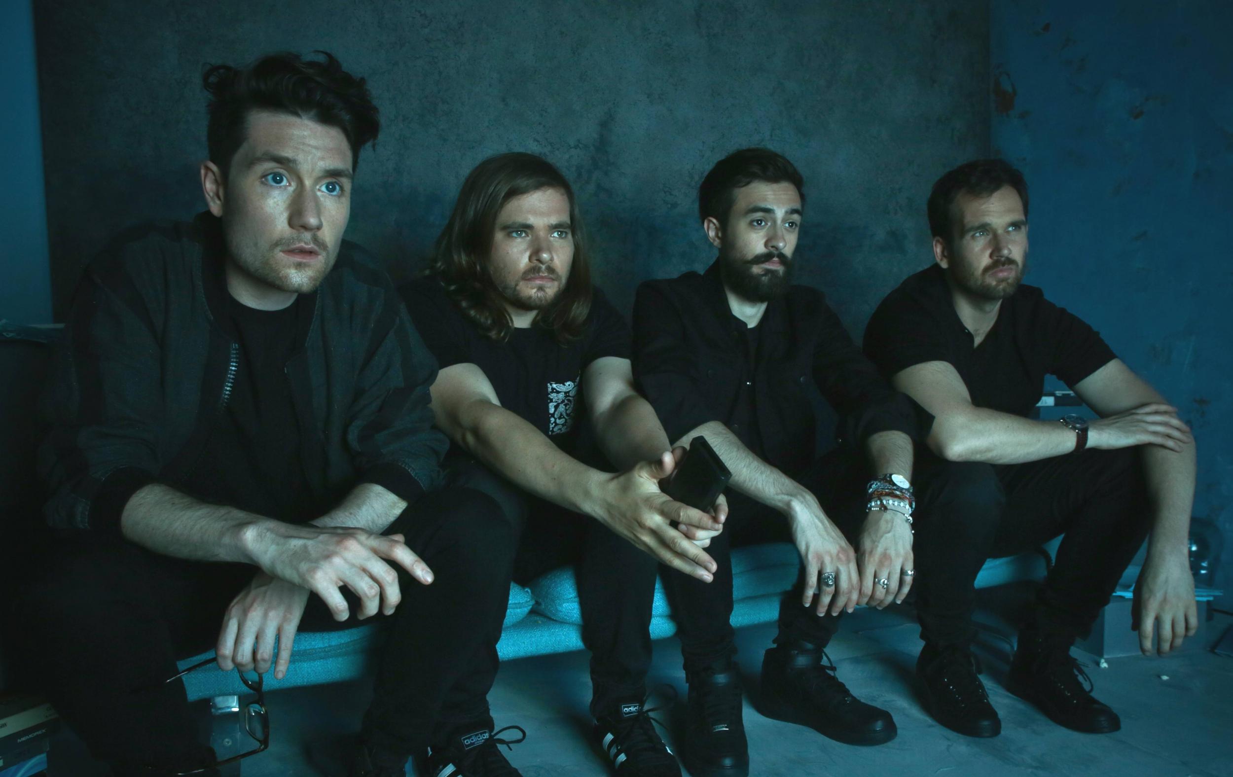
Bastille are a band which make music that is considered to be part of the electropop genre, as well as indie rock. They are signed onto the record label Virgin and have produced two studio albums: Bad Blood (2013) and Wild World (2016).
Their music has a dark undertone to it, also shown in the lyrics, which can be reflected through their music videos and brand image, including website.


On the home page we can immediately see this image with the promotion of a new single produced by the band, with the background photo holding multiple connotations of violence and crime. The photo features the lead singer of the band with blood on his face and clothes and his hands behind his back with handcuffs falling from them, as well as a police officer with a gun and vehicles in the background. The title "World Gone Mad" is the name of a song that they have created for the soundtrack of a film names Bright which stars Will Smith. We learn this from the links associated with the song at the bottom of the photo. The links are all for different platforms where the song can be listened to or bought, promoting it in a variety of ways. The example I have shown below is the Spotify link:

Other features that we can see on this homepage are the social media links in the top right corner of the page, a common feature to be seen on an artist's website. The links lead to a variety of platforms, including the most common ones such as Facebook, YouTube, Twitter, and Instagram. In the top right corner is also the link to Bastille's Spotify page so that listeners can follow them and listen to their music on this platform. The link to another streaming site, Apple Music is also put as a button below this.
At the bottom of the page are links to the legal information such as the Terms and Conditions and Privacy Policy, as well as naming their record label, Virgin EMI at the bottom. The Terms and Conditions and Privacy Policy link leads to a page for Universal Music, which owns the smaller label Virgin, and lists all the appropriate information in sections:

At the bottom is also the contact option for fans of the artist, through the platform of Facebook Messenger, which is shown in a button linking to the corresponding website. This is not an option given instead of the sign up option, as this is still given as a button on the banner at the bottom of the page.
If we click on the arrow on the picture it slides across to transition to another promotion of the last album that they released, Wild World. The links here are different as physical copies can be bought, so the links include those to the HMV website, amazon, and their official store where it can be bought in a box set.

Next we move onto the banner that links to different sites or other parts of the website. The first is "Live", which when selected brings up a black background and a box of text with all of the tour dates. These can be scrolled through and also have the link to an external website where the tickets can be bought. There is also the option of "Going", which when clicked on links to the website for Bands in Town, where fans can sign up and receive notifications on future tour dates and can say that they are going to this concert. This feature is expected on a musician's website, even if there isn't an upcoming tour the link is usually still their for when they do release tour dates alongside a new album or just for attending festivals, which is what Bastille appear to be doing here:


The next link in the banner is "Videos" which when selected leads to a banner of thumbnails at the bottom of the page with arrows which you can scroll through. However there is nothing featured at the top of this page, so what I would say as criticism is that a piece of text or a photo would be good to fill up this space. The videos at the bottom are a variety, from music videos to live performances, all presented by vevo. When clicked on the video appears as a pop up rather then directing people to a separate site such as YouTube. From there they still have the choice to scroll via arrows to other videos.

The next link, "Music" has a similar outcome to the video link, as a banner appears at the bottom with covers of albums and singles which people can scroll through, and there isn't anything again at the top of the page. When clicked on a pop up linked with Spotify appears with the track list and an option to play the song, as well as a link to the iTunes store if the audience would rather buy the album than stream it. The option is also available at the bottom of the page to view specific music they have released, such as an EP or Single.


This next link is a common feature on websites in which fans can receive updates on their favourite celebrity or any events that they may be interested in. The "Sign Up" option on this site is a pop up with logos of a variety of social media accounts that an individual can sign up with, from their email to Instagram. At the bottom the Universal logo is featured along with links to legal information again like the privacy policy. From this the audience can receive updates about upcoming music and tours and can feel a part of this community that is the fanbase of Bastille.


The last to links in the banner direct the consumer to a separate site where they can purchase items associated with the band. The link "Store" leads to a separate website in which all of the products sold are the albums, either in a pack, as a CD or even vinyl. At the top is a banner with links to the home page and to music, as well as a brief description about what singles are in each album, with its purpose being to persuade the audience to want to buy them.


The last link, "Merch", leads to another website that is also a store, however it doesn't sell their music but other products such as key-rings, items of clothing, bags and much more that all feature the band's logo or the name of an album. So when bought this benefits both the audience and the band as the audience is satisfied and happy they have merchandise, which when worn or used can promote the band.
The background on this page is their album cover, which links to how most of the merchandise is promoting the new album. There are also links and filters in the top left corner, narrowing the items down to products such as "Books", "T-shirts" and much more.

Overall I feel that although the website clearly matches the conventions of one promoting an artist, it doesn't match the genre of electropop in terms of colour and content. Despite being part of this genre, the band has a lot of dark tones to their music, which is shown throughout their lyrics and music videos, which can also be shown in the website to keep their brand image continuous and recognisable. I like this website and the dark underlying messages, as it reflects my song choice, as when you research further into it you can find out it's about mental health, and my artist's brand image is about erasing negative stigmas around controversial issues. So I thought that using this website I can see how an electropop band emphasised their dark meanings within their song, which is an idea for me when I make my website.
The target audience for Bastille would, like Eden, be teenagers or young adults specifically for their primary audience, as their secondary audience can be individuals that are 30+. These demographic is appropriate as younger individuals might be too young to understand or listen to the dark underlying meanings of the song, as well as it being inappropriate.