Fall Out Boy- MANIA:
For the final digipak I'll be looking at Mania by Fall Out Boy, whom's website I also researched on. As mentioned previously, as this album is new it's hard to find photos and videos of the album, but below is what I managed to find. This album was released January 2018 and involves a new theme for the band in terms of both music and design.
 The colour theme for the whole CD is purple, a vibrant neon colour; and white, which is used for things such as writing and illustrations. This neon purple matches the codes and conventions of an
The front cover is vibrant in this purple colour, featuring what appears to be a room with a window at the end showcasing the waves of the ocean, however this of course is tinted purple to match the overall theme. The edges of the room seem to be lit up by bright white lights, which is also reflected in the title of the album.
The title is white and the word 'Mania', has letter spacing that increases later on in the word. Both the title of the album and the band have a reflection in the floor and ceiling, and they also have this glow around them that makes them look lit up as well. The font is very narrow and not that bold, but this is contrasted by the glow and bright colour.
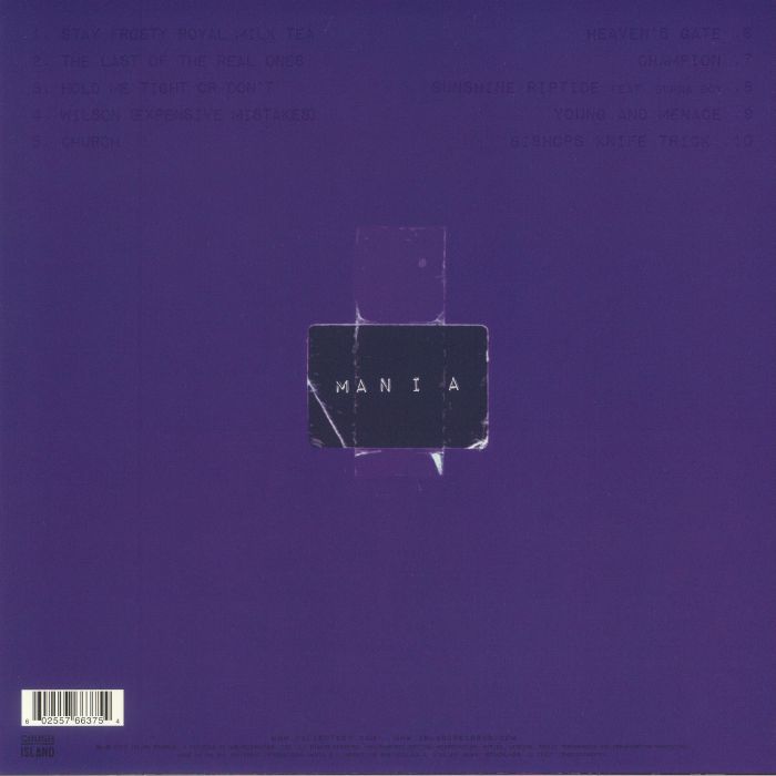
 For the back cover the purple is a lot darker but is still bold, however the writing is no longer white, and I personally feel that it is quite hard to read and don't know if this was done purposely or not.
We can see the track list at the top in columns with small font that isn't very visible. Underneath this we have a picture that looks like paper with sellotape sticking it to the album. The paper is made to look old, with white marks that show where it's been folded and ripped. The writing is the title of the album again, with the same font and letter spacing.
At the bottom is the bar code, and underneath we have the legal information in the same small, dark coloured text, as well as the logo for their record label that they're signed on to.
 For the inside of the album, we can see that the purple theme continues, for example with the disc, which is a very dark purple, and has a drawing of two creatures on them on white. These creatures are seen in some of the music videos for the band and are associated with this new album. that they even have names that are included in some of the track names of the album.
The sleeve is darker in colour on the back, with the faces of the four people in the band in a square around the title of the album again.
Overall I feel that in my opinion this album and it's design is quite simple yet unique, and I like the colour theme, the bright colours reflect electropop and are bold, which is what I hope to incorporate into my own digipak.
 The colour theme for the whole CD is purple, a vibrant neon colour; and white, which is used for things such as writing and illustrations. This neon purple matches the codes and conventions of an
The front cover is vibrant in this purple colour, featuring what appears to be a room with a window at the end showcasing the waves of the ocean, however this of course is tinted purple to match the overall theme. The edges of the room seem to be lit up by bright white lights, which is also reflected in the title of the album.
The title is white and the word 'Mania', has letter spacing that increases later on in the word. Both the title of the album and the band have a reflection in the floor and ceiling, and they also have this glow around them that makes them look lit up as well. The font is very narrow and not that bold, but this is contrasted by the glow and bright colour.
 For the back cover the purple is a lot darker but is still bold, however the writing is no longer white, and I personally feel that it is quite hard to read and don't know if this was done purposely or not.
We can see the track list at the top in columns with small font that isn't very visible. Underneath this we have a picture that looks like paper with sellotape sticking it to the album. The paper is made to look old, with white marks that show where it's been folded and ripped. The writing is the title of the album again, with the same font and letter spacing.
At the bottom is the bar code, and underneath we have the legal information in the same small, dark coloured text, as well as the logo for their record label that they're signed on to.
 For the inside of the album, we can see that the purple theme continues, for example with the disc, which is a very dark purple, and has a drawing of two creatures on them on white. These creatures are seen in some of the music videos for the band and are associated with this new album. that they even have names that are included in some of the track names of the album.
The sleeve is darker in colour on the back, with the faces of the four people in the band in a square around the title of the album again.
Overall I feel that in my opinion this album and it's design is quite simple yet unique, and I like the colour theme, the bright colours reflect electropop and are bold, which is what I hope to incorporate into my own digipak.
No comments:
Post a Comment