Wednesday, 21 March 2018

Creating my Digipak

First Draft:

Once I designed my digipak I then went onto photoshop to create a first draft.
As I wanted to have a neon effect I looked up tutorials on YouTube and found out how to use the outer glow effect.

This involved using the pen tool to draw a desired outline before changing its stroke to a white paint stroke, deleting the anchor points. After this the outer glow effect could be applied, manipulating the opacity and changing the colour. After watching the tutorial I decided to just test this method, creating this:


After this I moved onto drafting my digipak, using the design that I drew prior to this. I got an image of a rose outline, created a new layer and used it as a template for my pen tool, drawing around it. I them changed it to a paint stroke and added the outer glow effect. I had to do this twice as I wanted two different colours for my glow: red and green, and the outcome looked like this:

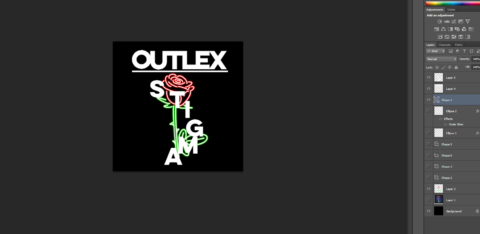
Once this was done I decided to add the text and cut the photo down to scale, so it looked more like a CD cover. In terms of the text I wanted to use a font not installed on photoshop: Lumos Clean. This was a font I found when creating my website, and used it for multiple things such as the page titles and the message left by Outlex on the homepage. I found a website where I was able to download a photo of the sample text with Outlex and Stigma written, so then I could use the select tool to drag it over onto my draft. For the artist's name I spaced out the lettering to stretch across the cover, and for the album name I moved the text to wrap around the rose. Once this was done I erased some of the rose outline to show the text, however kept some to look like the rose outline was actually wrapped around the text.
After this my draft was complete:

After getting used to the software and the process in which my digipak would be made, it was time to create the real product. I first found a digipak template that included a spine, as this was something extra that I wanted to design:
After the draft I realised that I didn't want to use this rose outline for my real product as it was too simple, so I browsed on google until I found this:
With this photo I really liked how bright the neon was and that it looked more realistic than the previous outline.
Once I had these I started the front cover.

Front Cover:

I created a file with the correct measurements for the front cover on my digipak template and added this image of the neon rose as a new layer. I then created a new layer, used the pen tool to draw the red part of the rose and used the outer glow effect on it, before doing the same for the green stem. Once this was done the original photo could be removed and I would have my rose outline finished.
After this I moved on to the text, using the same sample photos as before. Once the text was in place and shaped around the rose I again erased parts of the outline so that the text could be above it at some points and more visible.
This time I also decided to underline my text, as this is what I did on my website too, and I wanted to have a continuous theme throughout all of my products.
It was then decided after this that the background of the front cover looked a bit plain, and that usually neon lights have a bigger glow around them. So then I drew two circles around both the stem and petals of the rose in their separate colours, and added an outer glow effect with a bigger radius and a smaller opacity, as this is a faded glow. I then used the eraser to delete the original circles drawn and my outer glow was complete. To finalise the front cover I added a box around on the outside, and my front cover was them complete.


Back cover:

Using my drawings I went onto the back cover, starting by gathering templates for rose petals:
With this template I hoped to use the pen tool to draw around them and again use the outer glow effect, however after using it I still wasn't happy with the result and shape, as I felt it didn't look realistic enough. So then I used the pen tool without a template and drew a basic shape for my petals, changing the sizes and arrangement of them on my back cover. I then used the outer glow effect and again drew circles around them to create a background glow:

After this I added the title of the tracklist, using the same font Lumos Clean and underlining it, before creating the rest of the tracklist. I used the font at first barlow medium, as this was also on my website, however found it was too basic, so I made a few changes. Firstly I put the track numbers in a smaller font to the titles, and I changes the font to Artane Elomgated BT. At this point the back cover looked like this:
I then thought that the back cover didn't exactly match the front in terms of colour, so to incorporate green I added leaves with the same outer glow and background effect. After this all I had to do was add a barcode, legal information, catalogue code and the record label logo. Then my back cover was done:

Inside Sleeve:

For the inside I decided to have an outline of Outlex's eyes in a red neon effect. In order to do this I got a close up photo of Erika from our photoshoot day and put it into photoshop:

I then used the same technique of using the pen tool to draw around the eyes before turning it into a white paint stroke:

After I added the outer glow effect in the colour red. This was then transferred onto a black background and looked like this:

After this I tried to add text of one of the lyrics from Outlex's songs, using different techniques such as drawing it to finding fonts online:


After practising I decided the sleeve looked better without the text, and I proceeded to add on the legal information and record label logo again, completing the inside sleeve:

Disc:

For the disc I found a photo of a rose and shaped it to the size of a disc on my template. I then added an inner glow effect to darken parts of the photo so when text was placed on top it would be more visible:
Then I added the album title, legal information and catalogue code, arching the text to fit on the edge of the disc shape, and then the disc was done:

Spine:

Lastly I had to complete the spine, in which I just created a black background and add the artist and album titles with a rose outline in the middle, which I coloured green so I felt matched the rest of the colour scheme.
Once this was done I added the record label logo again and the catalogue code, and then my digipak was done.


Friday, 16 March 2018

Designing Merchandise

I have decided to have a variety of products for the merchandise of my artist, ranging from bags and shirts to neon signs and phone cases. All this merchandise has one theme to it that fans can recognise and associate with Outlex: roses.
I am using this theme in which a rose will be placed on the bags or shirts, possibly with a neon effect to make it stand out more.
Like with the digipak ideas, I looked up photos of roses which only had an outline and saved them for future use. I wanted to make sure that the photos had no background, as it would be easier to manipulate on photoshop. Some of the photos that I found are shown below:


I decided to go with the first photo of the rose as this was more colourful and simplistic, similar to the rose that I was going to design on my digipak. Once this was done I then looked up photos of products that had no design on them, such as a plan rucksack, which I could use and edit for Outlex's merchandise.
After my website research I had an idea on what products were conventionally featured on an artist's merchandise store, like t-shirts, the album and a vinyl. I also wanted to include unique products like a bath bomb, as I saw this when I researched onto Fall Out Boy's website and I thought it was a unique idea.
Some of the product photos I found are shown below:


After gathering these photos and more I went onto photoshop to edit them. I started off with the vinyl, adding the front cover of my digipak onto the template before exporting it to get this:
Once this was done I moved onto the shirts and bags, using the image of the rose from before and adding them on. With some of the products it didn't look like the rose was part of the shirt as it was too bright, so I went around with the different tools and decided to use the burn tool to darken the rose so that it would merge with the initial product more, looking more realistic.
The outcome that I got looked like this:

This was done with other products such as a black shirt and a white bag, before they were exported and posted to my website.
I then decided I would design a perfume for Outlex, using a photo of a perfume from the Beauty and the Beast film. I thought this would be a good choice as it has a rose on it, fitting with my current theme:

On photoshop I deleted the text underneath the rose before exploring different fonts and trying to create my own perfume name. However, the text didn't suit the perfume bottle and picture, so I felt it would look more realistic without a title.

After this I had all my products ready and kept uploading them to my website. The process involved adding a title to my product and a price before adding it on, and thanks to prior research I knew the price range for each product:
The menu where I was able to add products, change prices and the names of my products.


After this my merchandise was done, and it was time to finish my website.

Record Label Logo

When it came to designing my record label logo I already had a vision in mind. The name of my record label is Mirabillia Records, and I only wanted to use the letter M for my logo. It's the start of the name and is also a symmetrical letter, meaning my logo altogether can look symmetrical and neat.
In terms of incorporating a musical element I wanted to add headphones, so people would know this is a logo associated with music.
So first I found a photo of white headphones with a transparent background, it had an attached microphone but I knew I could edit it later in photoshop:

Next I went onto illustrator to design the 'M'for my logo. I typed up the letter in a simple yet bold font then chose the create outlines tool to edit it further. I wanted to have the sides of the letter to stretch out and be curved, so I did this on both sides until they looked symmetrical, getting this result:

I then took this over to photoshop where I added the headphones, shaping them to they fit around the letter. I then used a mixture of the select and eraser tool to remove the microphone part to make it look less like gaming headphones, and my logo was done:


Monday, 12 March 2018

Digipak Ideas

There is a lot of conceptual imagery associated with my artist Outlex, but one that is reoccurring in both the videos and photos of her is the use of rose imagery, both in the forms of clothing and props. So from this, I have decided that this theme will be continued onto my digipak as well.
I thought of numerous ideas and decided it would be good to incorporate a neon effect onto the photo of the rose, as this is another theme for Outlex and the genre of electropop. This way the album cover will be more bold in colour to stand out more, like Outlex's character.
When looking for ideas and photos I searched "Neon Rose", and numerous photos that I thought would be good inspiration came up, which I have shown below:

As well as this image, I plan on having some writing within my album to have a neon effect as well, whether it be the tracklist or lyrics in the sleeve of the album.

After this I decided to design my digipak on paper so that I could visualise it better and start adding ideas as I went along. For the front cover I drew a rose with titles on top and around it. The name of Outlex I wanted to be in bold and spaced out, which would match the website design too. The writing around the rose however I wanted to be sharp and 'cutting', to resemble thorns of a rose.
I made notes that I wanted this rose to just be a neon outline not filled in, and for the text to be white to stand out against a black background.
I then moved on to the back cover, in which I hoped to carry on this rose theme. I drew falling petals and a tracklist in the middle, before including the legal information and bar code. With the legal information I made a note that the record label logo would also be here, stating copyright and the record label name. Whilst designing this I wanted my tracklist to be in the same, bold font as the front cover, and to also be the same colour.
The inside sleeve I designed next, taking inspiration from Troye Sivan's album Blue Neighbourhood. On his album his sleeve was a booklet with images of falling leaves and lyrics on them. So for my sleeve I wanted to have a lyric from Angel On fire in a red neon colour and a black background. I also again included the legal information and catalogue code that I learnt should be there from my digipak research.
Finally I went onto the spine, I which I just added Outlex's name and the album name in the same font, with a simple rose design in between them. I again added the record label logo at the top and the catalogue code at the bottom.


The design is shown below:

It was useful to draw out my design as it them helped me to draft my front cover on photoshop and then eventually make the final product.

Wednesday, 7 March 2018

Website Ideas:


After conducting my website research I had a rough idea on what I wanted my website for Outlex to look like. I decided before making my website I would make some initial ideas so I could truly visualise what I wanted it to look like. I had a variety of ideas from doing my research, so I wanted to mix and match these ideas to make more than one design for my website, which I can refer to when it comes to actually making it.
Now that the photography has been done for Outlex as well, it will be a lot easier to picture where some example photos could go, and I can also have a gallery on the website. The photos can also be used on other social media platforms such as instagram, so the links on the website can actually lead to the profile of the artist.
The initial ideas I drew I also took photos of and have put below. I did a sketch of an idea of what I wanted the homepage to look like:


Image result for riverdale opening creditsThe drawing shows the basic layout of the first thing that an individual would see when they go onto the website. One idea for the title of the website is to have an animation for the name of the artist, Outlex. My inspiration of this is from the Riverdale opening credits, a show that is on Netflix. I want the text to reflect a neon light that when the website has just loaded, the 'lights' turn on and flicker a bit. I feel like this is different and unique, and suits the conventions of the genre of electropop as I am going to use bright neon colours and lights.
Under I want to include a banner with different links to the pages of the site, which is what I commonly saw when doing my research as it organises the website more and makes it easier to navigate. I decided to have the links: Home, News, Music, Videos, Sign Up, and Store. I feel like these are the main links that I have seen when I did my website research.
For the news page, I want to include updates on the artist and her music, such as tour announcements, nominations and reaching number one on a music chart. For Music, there will be a pop up or a separate page with links as to where the music can be streamed. These links include Spotify, iTunes, Youtube and more. The video link will direct people to Outlex's YouTube channel, where a variety of videos can be searched for and watched, from interviews to music videos.

Underneath this banner I want to promote the new music video for 'Angel on Fire', so I'm going to have the option there, and also arrows so they can scroll across and view other videos or see promotions and links to other things such as the tour or merchandise.
As you can see from the drawing I drew an arrow from this suggesting that another idea could be that I could insert another banner under this, such as a photo of the artist, before moving onto the 'About Me' section. In this next section I want to have an introduction to the artist, including basic information about her, for fans wanting to know or for new people visiting the site who may seek this information. The section will also briefly mention current topics in the artist's life, so this will be a way to promote both her new album and tour.
As I did a photo shoot for the artist, I want to display this on the website, in the form of a gallery. I have multiple ideas as to how I can incorporate this, with the first being a banner under the 'About Me' section, where you can have arrows to scroll along the banner and/or you can click on the photo yourself and scroll through them. Another idea is to have them as a block of photos, for example 3x3, that people can click on and scroll through rather than a banner. My final idea is to not even have the gallery on the homepage, but to include another link on the banner at the top titled 'Gallery', which will direct people to a completely separate page where they can view photos of Outlex at her photo shoot.

I want to also promote the social media that Outlex has, so I will include buttons of the logos of each of them. I will also try to create these social media accounts so the link actually works, to make the website more realistic. With these buttons I also want to include ones for streaming and buying music, for example on Spotify and Amazon.

After this is the end of the homepage, so I will just add in both Outlex's and the record label's logo, as well as having links to the terms and conditions and privacy policy, as this is something I commonly see at the bottom of websites when I did my research.

Monday, 5 March 2018

Digipak Research


Fall Out Boy- MANIA:

For the final digipak I'll be looking at Mania by Fall Out Boy, whom's website I also researched on. As mentioned previously, as this album is new it's hard to find photos and videos of the album, but below is what I managed to find. This album was released January 2018 and involves a new theme for the band in terms of both music and design.
Image result for mania fall out boyThe colour theme for the whole CD is purple, a vibrant neon colour; and white, which is used for things such as writing and illustrations. This neon purple matches the codes and conventions of an
The front cover is vibrant in this purple colour, featuring what appears to be a room with a window at the end showcasing the waves of the ocean, however this of course is tinted purple to match the overall theme. The edges of the room seem to be lit up by bright white lights, which is also reflected in the title of the album.
The title is white and the word 'Mania', has letter spacing that increases later on in the word. Both the title of the album and the band have a reflection in the floor and ceiling, and they also have this glow around them that makes them look lit up as well. The font is very narrow and not that bold, but this is contrasted by the glow and bright colour.

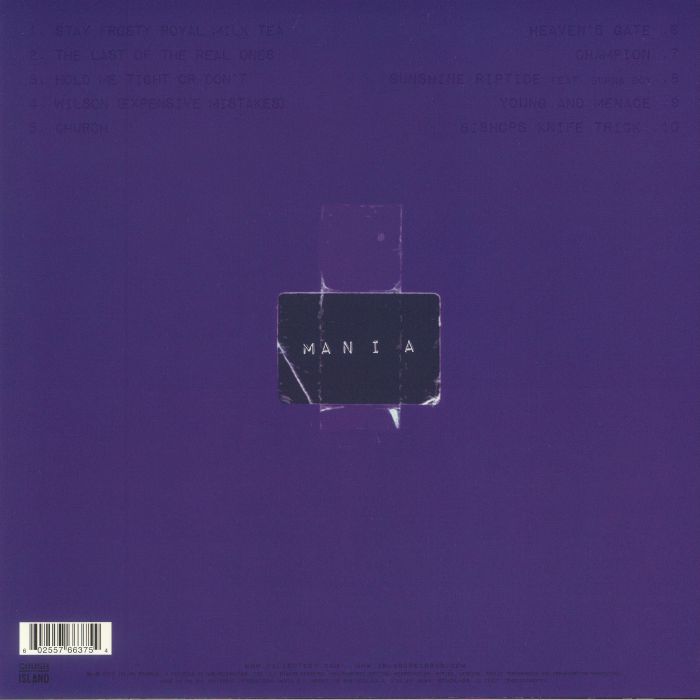
Related imageFor the back cover the purple is a lot darker but is still bold, however the writing is no longer white, and I personally feel that it is quite hard to read and don't know if this was done purposely or not.
We can see the track list at the top in columns with small font that isn't very visible. Underneath this we have a picture that looks like paper with sellotape sticking it to the album. The paper is made to look old, with white marks that show where it's been folded and ripped. The writing is the title of the album again, with the same font and letter spacing.
At the bottom is the bar code, and underneath we have the legal information in the same small, dark coloured text, as well as the logo for their record label that they're signed on to.

Image result for fob mania album discFor the inside of the album, we can see that the purple theme continues, for example with the disc, which is a very dark purple, and has a drawing of two creatures on them on white. These creatures are seen in some of the music videos for the band and are associated with this new album. that they even have names that are included in some of the track names of the album.
The sleeve is darker in colour on the back, with the faces of the four people in the band in a square around the title of the album again.
Overall I feel that in my opinion this album and it's design is quite simple yet unique, and I like the colour theme, the bright colours reflect electropop and are bold, which is what I hope to incorporate into my own digipak.

Friday, 23 February 2018

Digipak Inspiration


Moodboard:

In order to find inspiration and ideas for my digipak, Erika and I went through a handful of artists and google searches and decided that the ones we liked we would put together on a moodboard. This is so that when the time comes to designing my own digipak I can refer to this for ideas which I can manipulate in my own way for my own product.


This photo above was the first set of albums that we managed to find with the general search of "digipaks". What I like in particular is the shapes these artists use, and how there is a picture in the shape, for example with Michael Jackson's "This Is It". For Rihanna I liked the rose imagery and how the disc is a rose, which is also a huge part of Outlex's brand image, my artist.


This photo was when we were thinking of artists in particular that we like and have interesting album covers. I like the Chainsmokers' covers for singles such as "Roses" as I think the box with the painted background is something I would like to try and could suit my artist's image. For "Mania" by Fall Out Boy I like the bright colour and lighting, as neon colours and lights is part of the conceptual imagery in my music video and I might want to incorporate that into my digipak. Overall on this photo I love the bright colours and shapes, they stand out compared to other albums we might see.


This final photo is similar to the last in which we looked up various artists and also went through our own music library to see if there are any covers that stood out to us. Here I like the bright colours in the albums and I really like the fonts, e.g. Bastille and Daft Punk. With Daft Punk I thought about How I could do that text with a roses background, or even with a photo and not text.

Looking up all of these albums helped me to gain more of an idea on what I want to be included in me digipak in terms of colour, text and the props in the photo. I have noticed that the artists aren't on many of these album covers, but instead images associated with them and their album, which is the approach I could use for my digipak.

Fall Out Boy- Website Research

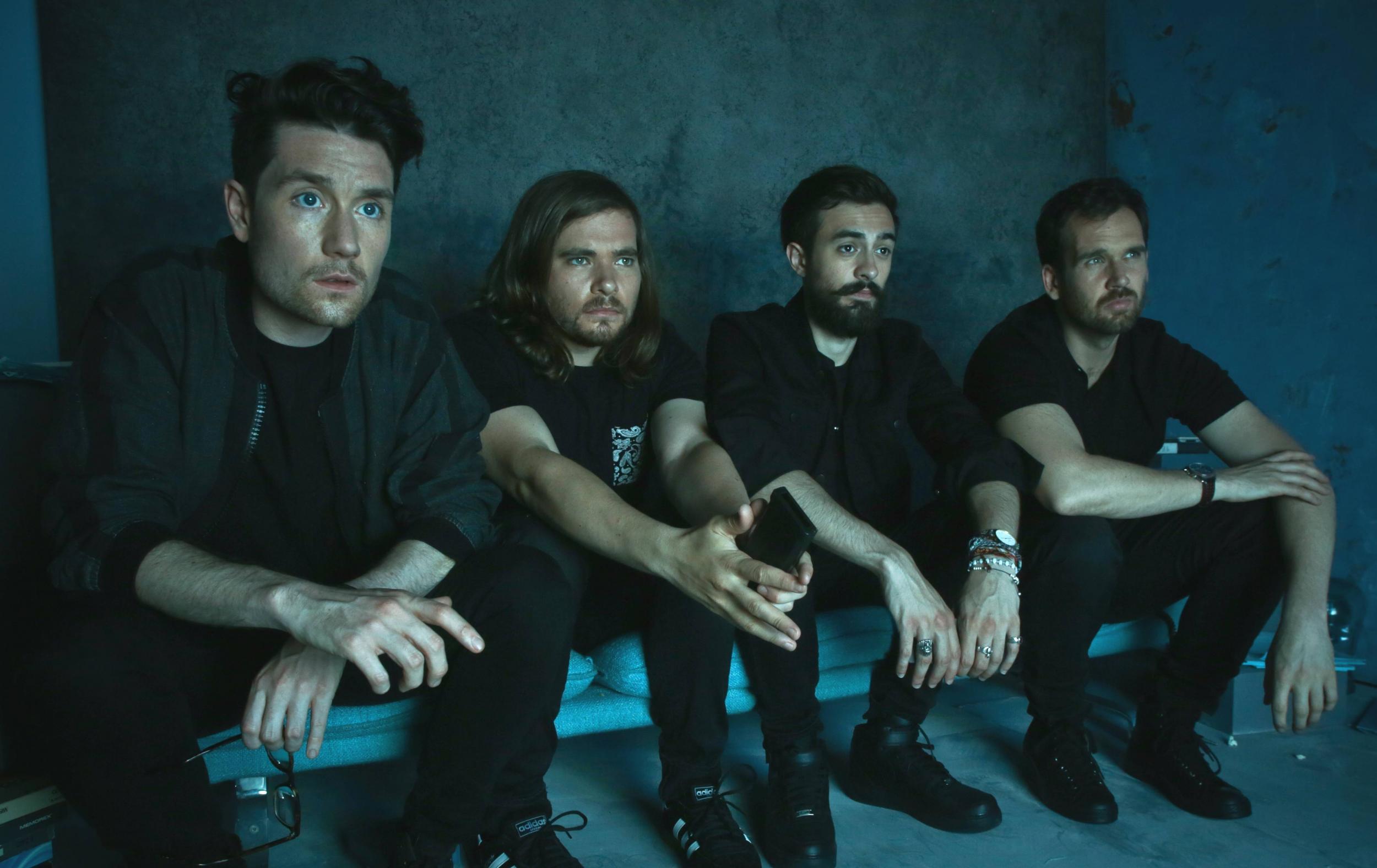
Image result for fall out boyFall Out Boy are a band that have been producing music since 2001, and have been signed onto multiple record labels such as Uprising and Fueled by Ramen, Island, and DCD2.
Although previously considered to produce music from the genre of rock, Fall Out Boy have gradually altered their music with each album, resulting in their most recent one released January 2018, Mania, being highly electronic as well as having the elements of rock from the older music, so it can be said that their new style of music is electronic rock. This is definitely reflected in their website and music videos, with neon purple being an important colour for them and their new brand image.

The first thing we see on the website is the cover for their new album Mania, with a link to purchase or stream the album, and a button to see upcoming tour dates that were released alongside the album. This front page we can see its all purple, a colour associated with the electropop genre, and the edges of this cube that seems to be in the future are also very brightly lit up, contributing to this neon theme. The photo in the middle is of the ocean but has been colour graded to be purple, so everything in the photo has this purple tint that stands out a lot due to its brightness and sharpness of colour.
This is the home page and we have the banner in the corner leading to other parts of the website, but we can also scroll down on this page where there are other promotions for videos and individual songs.

Below is a video of the website when being scrolled through, and how each photo fills up the whole screen, promoting different aspects associated with the band. I put this in a video to show the scrolling motion and how each photo is revealed and how it looks as though they overlap each other. The sections promote the tour and individual songs that have music videos, so as we can see there are links to watch the video and to go onto another platform to download or stream the song. I think that this is a really creative way to scroll through the website and showcase different features associated with the band.

At the bottom of this page we see a section where fans of the band can show off any merchandise that they have bought from the band using a hashtag on the social media platform Instagram. Underneath there are a few example photos that an individual can scroll through to see other fans showing their merch, and it encourages others to do the same so that they could be featured on the official website.

The next section includes all of the social media links as buttons against a purple background, fitting with the new theme of the band. The social media links include Twitter, Facebook, and even Tumblr; and there are also links to platforms in which their music can be listened to, such as Spotify and Youtube. Finally we have links to amazon, apple store and other platforms where music can also be purchased.
As usual we have logos/links for the record label that the band is signed onto, as well as their official logo at the bottom which can be recognised easily by fans. The record label link directs us to the official website of the label, so this website also promotes other artists if clicked on, as we can see other artists signed onto the same label. There are 3 listed below: Island, Crush Music and DCD2 Records.

If we go back to the top of the home page we see a banner with links to other pages, such as "News" and "Videos". The first link is News, and this page consists of a picture of the band at the top, and then we can scroll down to see updates from the band. The updates are about tour, such as performing in China and Reading Festival, as well as on shows such as "Good Morning America". These updates of course promote the band but can promote the festival and TV show that they will be featuring on. This page is good for fans wanting to receive these updates, especially if they want to see the band on tour, and they can also read general news such as announcing that the band's new album reached Number 1 on the Billboard 200.

The next link in the banner is "Tour", in which the layout is very similar to the news page, as we have a title at the top with a picture of the band as a background for the top banner. This page is like any other tour page, with a list of the dates and venues, then a link to buy tickets from Bands in Town, or instead the button can say "sold out" instead and not have a link to another page once the tickers from a particular show have all been sold. This is a world tour called Mania Tour, so there a lot of dates from which the band can gain profit and there is also more of a choice for the audience if there is another venue that isn't sold out that's still close to them. The banner for the tour also as a list of the support acts that will be joining them on different parts of their tour, so they are promoting these smaller bands before the show so that people can listen to them to see if they like them and can familiarise themselves with the songs when it comes to seeing them live before they see Fall Out Boy.

The "Music" link is next, taking us to a different site altogether with a different layout to the previous two pages. Like with other websites, we have links and logos where the audience can both stream and/or buy the band's music. The "play" buttons are associated with sites in which the music can be simply streamed, like Apple Music, Spotify and YouTube. Other links show where music can be downloaded or bought, from sites such as amazon where both a physical and digital copy can be bought. At the top of the page the band's logo appears again, with the caption "Listen to Fall Out Boy's music".

The video link that is next directs us to the platform of YouTube, specifically the band's channel where multiple types of videos can be viewed, from music to tour videos and even behind the scenes videos showing the making of particular music videos.

The "Sign Up" links leads to a page with the photo of the band as a banner behind the title. The page encourages you to sign up to receive emails from Universal Music Group (UMG), with possible updates from the band such as new tour dates or a single/album. The page asks for a few details before submitting it and in turn agreeing to the UMG privacy policy, which is also a link before the submit button that fans can read in case they want to know before submitting their information.

The last link for "Store" takes us to a different website which has the band's album cover at the top and logo. We can scroll down through the different products, and they have a variety, from a bath bomb (with the purple theme) to even a snow globe. The products can be clicked on to gain information, and also look at more photos associated with them. As well as these unique products, we also have the classic shirts and also the album, in both vinyl and CD format, which can be bought to have stickers come alongside them. At the bottom we again have the option where fans can share photos of them with their merchandise, which is appropriate considering this is the site for merch and where it can purchased. I like the store as it has the conventional merchandise of on artist, but we also have unique ones that can make them stand out from other artists, and these 'quirky' products might be more memorable to fans due to how different they are to the conventional products.


The website overall is well put together and is very organised and easy to navigate, clearly highlighting each section and promoting their music in multiple ways. From the website it can be said that their target audience is of those of a younger demographic, for example teenagers and young adults. Those who were fans of Fall Out Boy in the 2000's can also still be fans of their new music, incorporating individuals of the age 30+. The website is very bright with the purple theme and the music is lively and has its electronic elements, which can appeal to this younger audience. The section where fans can show off their merchandise mainly consists of those of the younger age as well, supporting what I think their target audience is.

Thursday, 8 February 2018

Bastille- Website Research

Image result for bastille
Link: http://www.bastillebastille.com/

Bastille are a band which make music that is considered to be part of the electropop genre, as well as indie rock. They are signed onto the record label Virgin and have produced two studio albums: Bad Blood (2013) and Wild World (2016).
Their music has a dark undertone to it, also shown in the lyrics, which can be reflected through their music videos and brand image, including website.


On the home page we can immediately see this image with the promotion of a new single produced by the band, with the background photo holding multiple connotations of violence and crime. The photo features the lead singer of the band with blood on his face and clothes and his hands behind his back with handcuffs falling from them, as well as a police officer with a gun and vehicles in the background. The title "World Gone Mad" is the name of a song that they have created for the soundtrack of a film names Bright which stars Will Smith. We learn this from the links associated with the song at the bottom of the photo. The links are all for different platforms where the song can be listened to or bought, promoting it in a variety of ways. The example I have shown below is the Spotify link:

Other features that we can see on this homepage are the social media links in the top right corner of the page, a common feature to be seen on an artist's website. The links lead to a variety of platforms, including the most common ones such as Facebook, YouTube, Twitter, and Instagram. In the top right corner is also the link to Bastille's Spotify page so that listeners can follow them and listen to their music on this platform. The link to another streaming site, Apple Music is also put as a button below this.
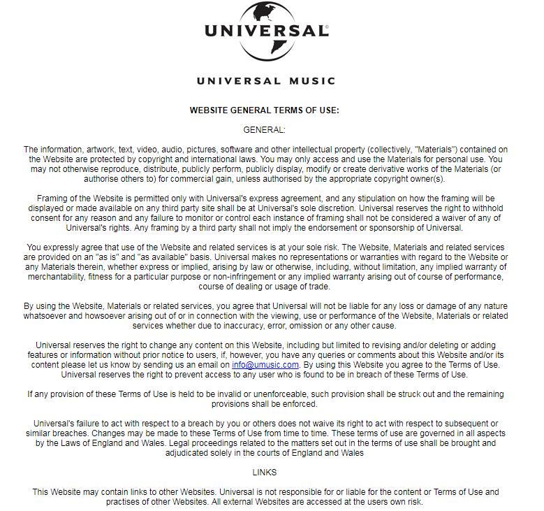
At the bottom of the page are links to the legal information such as the Terms and Conditions and Privacy Policy, as well as naming their record label, Virgin EMI at the bottom. The Terms and Conditions and Privacy Policy link leads to a page for Universal Music, which owns the smaller label Virgin, and lists all the appropriate information in sections:

At the bottom is also the contact option for fans of the artist, through the platform of Facebook Messenger, which is shown in a button linking to the corresponding website. This is not an option given instead of the sign up option, as this is still given as a button on the banner at the bottom of the page.
If we click on the arrow on the picture it slides across to transition to another promotion of the last album that they released, Wild World. The links here are different as physical copies can be bought, so the links include those to the HMV website, amazon, and their official store where it can be bought in a box set.

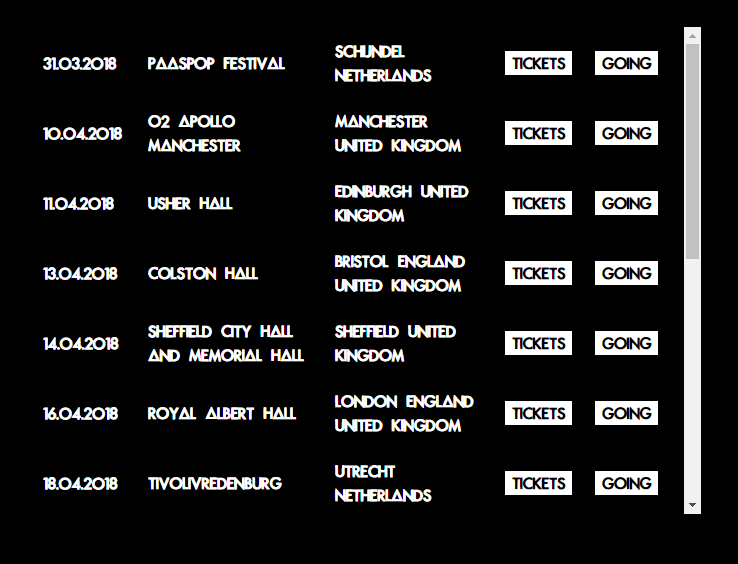
Next we move onto the banner that links to different sites or other parts of the website. The first is "Live", which when selected brings up a black background and a box of text with all of the tour dates. These can be scrolled through and also have the link to an external website where the tickets can be bought. There is also the option of "Going", which when clicked on links to the website for Bands in Town, where fans can sign up and receive notifications on future tour dates and can say that they are going to this concert. This feature is expected on a musician's website, even if there isn't an upcoming tour the link is usually still their for when they do release tour dates alongside a new album or just for attending festivals, which is what Bastille appear to be doing here:


The next link in the banner is "Videos" which when selected leads to a banner of thumbnails at the bottom of the page with arrows which you can scroll through. However there is nothing featured at the top of this page, so what I would say as criticism is that a piece of text or a photo would be good to fill up this space. The videos at the bottom are a variety, from music videos to live performances, all presented by vevo. When clicked on the video appears as a pop up rather then directing people to a separate site such as YouTube. From there they still have the choice to scroll via arrows to other videos.

The next link, "Music" has a similar outcome to the video link, as a banner appears at the bottom with covers of albums and singles which people can scroll through, and there isn't anything again at the top of the page. When clicked on a pop up linked with Spotify appears with the track list and an option to play the song, as well as a link to the iTunes store if the audience would rather buy the album than stream it. The option is also available at the bottom of the page to view specific music they have released, such as an EP or Single.


This next link is a common feature on websites in which fans can receive updates on their favourite celebrity or any events that they may be interested in. The "Sign Up" option on this site is a pop up with logos of a variety of social media accounts that an individual can sign up with, from their email to Instagram. At the bottom the Universal logo is featured along with links to legal information again like the privacy policy. From this the audience can receive updates about upcoming music and tours and can feel a part of this community that is the fanbase of Bastille.


The last to links in the banner direct the consumer to a separate site where they can purchase items associated with the band. The link "Store" leads to a separate website in which all of the products sold are the albums, either in a pack, as a CD or even vinyl. At the top is a banner with links to the home page and to music, as well as a brief description about what singles are in each album, with its purpose being to persuade the audience to want to buy them.


The last link, "Merch", leads to another website that is also a store, however it doesn't sell their music but other products such as key-rings, items of clothing, bags and much more that all feature the band's logo or the name of an album. So when bought this benefits both the audience and the band as the audience is satisfied and happy they have merchandise, which when worn or used can promote the band.
The background on this page is their album cover, which links to how most of the merchandise is promoting the new album. There are also links and filters in the top left corner, narrowing the items down to products such as "Books", "T-shirts" and much more.

Overall I feel that although the website clearly matches the conventions of one promoting an artist, it doesn't match the genre of electropop in terms of colour and content. Despite being part of this genre, the band has a lot of dark tones to their music, which is shown throughout their lyrics and music videos, which can also be shown in the website to keep their brand image continuous and recognisable. I like this website and the dark underlying messages, as it reflects my song choice, as when you research further into it you can find out it's about mental health, and my artist's brand image is about erasing negative stigmas around controversial issues. So I thought that using this website I can see how an electropop band emphasised their dark meanings within their song, which is an idea for me when I make my website.
The target audience for Bastille would, like Eden, be teenagers or young adults specifically for their primary audience, as their secondary audience can be individuals that are 30+. These demographic is appropriate as younger individuals might be too young to understand or listen to the dark underlying meanings of the song, as well as it being inappropriate.

Thursday, 25 January 2018

EDEN- Website Research

Website:

Image result for edenLink: http://iameden.eu/
Eden is an artist that produces music from the genres electronic dance music, indie pop and dream pop. He is currently signed onto the record label Astrelwerks, with whom he released two albums: i think you think too much of me (2016) and vertigo (2018)
At the top of the website is the artist's name against a background of a sky, which is the brand image for his new album. There is no banner at the top of the website with links to his store, a gallery or other pages from his website, as they are incorporated throughout the home page in different sections as you scroll down. This is uncommon for a website for an artist in the music industry, as the links are usually at the top to make the website easier to navigate and to straight away promote the store and its products. It could be said that Eden's website is laid out like this to encourage the consumers to scroll through the website and to see the other sections of the website they weren't looking for, but may suddenly now be interested in due to scrolling past it.
 The website promotes the recent album vertigo by featuring a photo of a sky, with the name of the album, which is also the same photo used on the front cover of his album. This links to a separate website where people can listen to the music, which is the same website that the "Out Now- Click Here To Listen" button is linked to.
The colour scheme of the website is conventional to the genre of the music, such as dream pop and electronic. The pastel colours can link to dream pop as they are quite soft, and the photo of the sky to me connotes relaxation and curiosity. In terms of electronic the typical colours associated with the genre involve blue, which is shown a lot within the background photo and the album cover of the website.


Underneath this button we can see the logos of various social media ranging from Twitter to Instagram, which link to Eden's profiles on these platforms. The links are placed here so that the consumer can follow the artist on these different forms of social media, this promoting him and his music. It is common for a celebrity to promote their social media on a website, and in turn on these platforms they promote their music and perhaps other forms of social media.


The next section of the website promotes the artists new music video, "float", as well as his new album and tour. Once again a picture of the album cover is featured however this is the full photo with the artist's logo at the bottom. Under this photo we can see multiple links to different platforms from which the album can be purchased (Amazon, Vertigo store, iTunes) or streamed (Spotify, Apple Music, Google Play). The promotion of the tour is another button linking to a separate part of the website with all of the tour dates and locations. On this page  buttons names "Tickets", which once again links to a separate page names Bands in Town where an individual can purchase
them. It is very common for tours to be promoted on a musician's website, so Eden's website matches the conventions of one, as he wants people to see him perform songs from his new album on live.

We can also see that the social media logos appear again underneath a "Join Eden" button which when clicked on brings up a pop up where the consumer can join the community via Google or Facebook, giving them the chance to win tickets to a show. This is a common feature on websites of musicians so that people can receive updates on the artist, such as when their album comes out or if tour dates have been released. It is also common on other websites to offer this option, where people can sign up to 'receive newsletters', such as a clothing website to receive emails about new items of clothing in stock.
This button also appears further down on the home page of the website under a section about merchandise, from which the same pop up appears:


Back on the home page of the website the next section is on merchandise, with photos showing new items of clothing that are linked with the new album. Below these photos is a button called 'Eden Official Merch', and the 'Join Eden' button after that. All of the photos and the official merch button have the same link: Eden's merch page. This page is only small as there is a small amount of merch produced. Again on this website we see the 'Join Eden' option at the top, and his social media links at the bottom of the page. Unlike the home page, this page has a banner under Eden's name with links to "Home", "Music" and "Contact".


In this section there is no text nor are there links, but instead a selection of videos from YouTube. The first three videos are music videos for songs that are on Eden's recent album: crash, gold, and start//end. The last two are separate clips, with the one titled "movement" consisting of a montage of establishing shots and conceptual imagery alongside some fast-paced music. The video is quite mysterious, with only one piece of text at the end stating that "ends are beginnings", and doesn't seem to promote any music.
The last clip has a voiceover of Eden talking about his experiences throughout 2016, which then fades into a song and another montage of clips, e.g. of him performing in concert. On a website for a musician it is common for music videos to be featured, especially ones that are linked to a new album, to promote it so the audience may consider buying it from their store. The last video in particular can promote his tour due to all of the clips featured, making those who watch it want to see him live one day.


The rest of the website consists of more videos of music videos, a message to the audience from the artist talking about how amazing his year and tour experience has been, and some more album and tour promotion. An old album fro 2016 is shown, with both the album cover then further down a track list linked up to Spotify. The tour promotion just consists of posters from previous tours that he has been on and the name of them, to create this nostalgic feel as though the further a person scrolls the more they go back in time.
The website overall matches the conventions for both a musician's website and one that produces music from the genre of electronic music and dream pop
In terms of the target audience, as the music is part of the electronic genre and the website's appearance matches the conventions of this, I would say that the audience are younger, for example teenagers and young adults, as in concert Eden also likes to play music that people can dance to and have fun. 
I chose this website as I like the colour scheme of it and how pastel and subtle it is, and these colours and shots of the sky I could use as an idea for my own website, put perhaps one with sharper colours to make it less relevant to dream pop and more electronic in its look.